This marking period, I am continuing the Astrological Sign series. This time, I will make Leo, Pisces, and Gemini. I sketched and planned some ideas for the final products above. My fourth piece for the marking period is my portfolio video that I am using to submit to colleges.
Wednesday, November 30, 2016
Sunday, November 20, 2016
Bomboy - Schedule 11/14-11/18
Monday - Premiere Pro
Tuesday - Premiere Pro
Wednesday - Taping game footage
Thursday - Premiere Pro
Friday - Finishing touches on video
Tuesday - Premiere Pro
Wednesday - Taping game footage
Thursday - Premiere Pro
Friday - Finishing touches on video
Bomboy&Nagle - Portfolio Video (AKA Studio Work #1)
After a couple of weeks (actually now that I think about it, it was probably more like a month), I've been working on pulling all of my art throughout my high school career together to make a portfolio video to submit to colleges. Though I do regret I did not add everything I wished to, I am still pretty confident about the product. I am sending this to George Mason University and the University of Southern California as of right now.
Reflection: At first, I thought this was going to be easy. I've made videos before, right? Well, I was wrong. Finding the time to photograph, saving/finding all the videos I desired, and then just turning it into a finished product I'd be proud of was difficult. However, due to deadlines, this is what was created with my time and ability and I am content with what I have made. I may be a little uneasy just because someone is going to watch this and judge my abilities only based on this video; if it wasn't made for that purpose, I'd bet I'd be happier with it. In all, I hope this video is successful and I guess I'll find out when I receive my acceptance/denial letters.
Monday, November 14, 2016
Bomboy - Line Weight Test


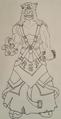
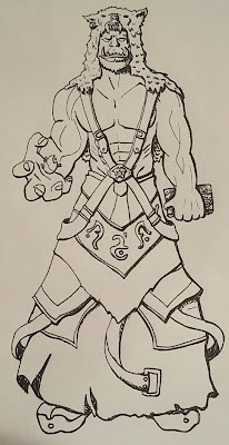
Last week I did an investigation on line weight and why and how it is used. This week I took a drawing I did in one line weight and changed it based on my discoveries. In the "new" version I added a light source to the upper left corner and then darkened the figure from there. I have to say the face of the new one does have more interest than it used to and the darker lines draw my eyes to the sketch. This line weight thing does hold validity in making my plain sketches a little more eye-catching. However, as you can tell, I am not good at it right now, but hopefully that will change in the future.
Sunday, November 13, 2016
Bomboy- Schedule 11/7-11/11
Monday - Edited Pictures
Tuesday - Edited Pictures
Wednesday - Gather digital model pictures
Thursday - Gather animations
Friday - Gather videos
Tuesday - Edited Pictures
Wednesday - Gather digital model pictures
Thursday - Gather animations
Friday - Gather videos
Sunday, November 6, 2016
Bomboy - Line Weight and Jacquelin Deleon


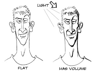
Above, I found this image where first the brush stroke goes from thin to heavy. In perspective, the thick end would be closer. Usually for perspective, the closer the object is to you, the bigger, and the further away, the smaller. The circles, on the other hand, shows why using thin or thick lines can emphasize depth. If everything was drawn with the same line weight, it would look flat. Background objects should have thinner lines and foreground objects should have thicker lines.
Currently I am obsessed with watching a YouTuber's art videos and she pretty much has perfected the use of line weight. Above are two of her pieces where I thought you could see the line art the best and the weight of the lines to make her pieces more aesthetically pleasing. Her name is Jacquelin Deleon and her name there is linked to her YouTube channel. She's a freelance artist who mainly gets commissions to design tattoos and also self-published a comic booked named "The Sirens of San Francisco". She lives in San Jose, CA, and graduated from Laguna College of Art and Design with a BFA in Illustration and Entertainment Design. Watching her process (many times at this point) is very interesting and I believe will help me find my own process; also, she uses a brush pen to line her art and I think I am going to go get one to help with my line weight.
As pointed out to me, my art only has one line weight and has resulted in my pieces looking flat. I need practice implementing line weight. Next week, I am going to do a sketch test with line weight (much like the examples above) as my sketchbook page and also try and use it in my pieces for Senior Portfolio.
Bomboy - Schedule 10/31-11/4
Monday - GDD
Tuesday - Portfolio Pictures
Wednesday - Portfolio Pictures
Thursday - Portfolio Pictures
Friday - Portfolio Pictures
Tuesday - Portfolio Pictures
Wednesday - Portfolio Pictures
Thursday - Portfolio Pictures
Friday - Portfolio Pictures
Subscribe to:
Comments (Atom)
