
Above, I found this image where first the brush stroke goes from thin to heavy. In perspective, the thick end would be closer. Usually for perspective, the closer the object is to you, the bigger, and the further away, the smaller. The circles, on the other hand, shows why using thin or thick lines can emphasize depth. If everything was drawn with the same line weight, it would look flat. Background objects should have thinner lines and foreground objects should have thicker lines.
Currently I am obsessed with watching a YouTuber's art videos and she pretty much has perfected the use of line weight. Above are two of her pieces where I thought you could see the line art the best and the weight of the lines to make her pieces more aesthetically pleasing. Her name is Jacquelin Deleon and her name there is linked to her YouTube channel. She's a freelance artist who mainly gets commissions to design tattoos and also self-published a comic booked named "The Sirens of San Francisco". She lives in San Jose, CA, and graduated from Laguna College of Art and Design with a BFA in Illustration and Entertainment Design. Watching her process (many times at this point) is very interesting and I believe will help me find my own process; also, she uses a brush pen to line her art and I think I am going to go get one to help with my line weight.
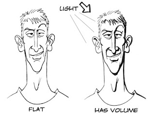
As pointed out to me, my art only has one line weight and has resulted in my pieces looking flat. I need practice implementing line weight. Next week, I am going to do a sketch test with line weight (much like the examples above) as my sketchbook page and also try and use it in my pieces for Senior Portfolio.
No comments:
Post a Comment