Here is the final product of Pisces. I created more shadow with more shades of pink and then created very light blue and pink to create a scale pattern. Since Pisces is two fish circling each other, I decided to go with the traditional yin and yang to symbolize how Pisces needs both sides of themselves. I very much enjoyed the process of making this piece and I may continue with it for future pieces. I think it turned out amazing compared to the others (even though now that I look at the picture, I wish I did more dimension in the middle part of her hair, but hey, Finish, Not Perfect).
Wednesday, December 21, 2016
Nagle - Pisces Process #2
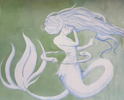
Done with the under-painting, I wanted to create a more dramatic contrast of the figure from the background. So I settled for a more greenish-blue to paint the background. I did mess up and had a very dark spot in the upper left corner, so I fixed it by kind of creating a transition from a darker green to a lighter one.
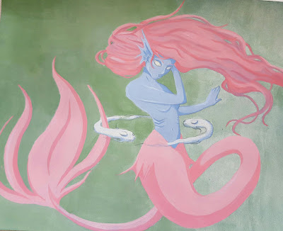
Then, I chose the colors of the mermaid and settled with more pastel colors. The under-painting helped so that one coat of the same shade of pink and blue made pre-made shadows and highlights. I did go back in with a slightly darker shade of that color to emphasize the shadows.
Nagle - Pisces Process #1
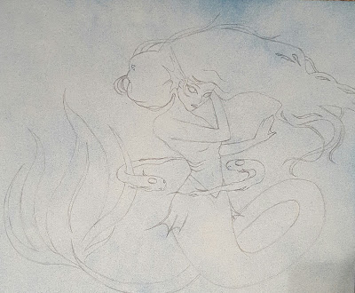
For Pisces, I decided to try something different and make a smaller piece using acrylic paint. First, I spray-painted the background with blue and white to get an interesting texture in which I drew my sketch on (above). Second, Mr. Nagle suggested I try under-painting--so I took a very watered-down blue and chose where the darkest parts of the piece were going to be (shadows). Then, I took a light watered-down blue to do the same thing for highlights. Below is what the piece looked like once I was done.
Monday, December 19, 2016
Bomboy - The Met and MoMA Reflection
Last Friday, art students went on a field trip to New York City where we visited The Metropolitan Museum and the Museum of Modern Art. While there, I saw many interesting pieces of art history and some stuck in my mind.
First, we went to The Met. Here, since I already been before, I wanted to focus on some of the exhibits that I previously wished I had more time at. That included Africa, the armor and weapons, and Egypt. Africa always interested me because most of it was huge wooden pieces that showcased their culture. For example, there were wooden and grass suits that they wore to worship the recently deceased and towering totem poles that emphasized their interest in the human body. Next, I had always been interesting in the intricate details some armor and weapons have, and I was not disappointed with the collection here. I have to say I think my favorite item there was either one of the halberds that were full of designs or this hunting knife/gun hybrid that just looked amazing (I want to know if it worked well). After that, it felt like I stepped into Egypt with the temple that was rebuilt in the museum and I got to see beautiful jewelry and games they used to wear/play in the past. One of the interesting things I saw there were gold-encasings for fingers and toes. I guess it was some sort of a jewelry? I don't see how you could do anything wearing them though... maybe they were for the dead? (Idk, there was a huge gaggle of kids in front of the sign and I was not about to fight through that.) Other than that, there were a ton of rings with scarabs on them and I wish I owned one because that is my kind of aesthetic attraction--small and simple, but also beautiful. After The Met, we trekked through Central Park, past Trump Tower, through the biting cold, and made it to the MoMA.
I also had visited the MoMA in the past, but I saw pieces that I do not remember (most of them being phallic and scarring in nature). Now, I am absolutely NOT a huge fan of modern art, but I sure did get some good laughs out of some of it. For example, one of the pieces was literally a string. Yes, a string. One that was attached to the ground and the ceiling and not noticeable at all so a guard had to stand next to it to ensure someone didn't run into this poor string and snap it. Or maybe I should bring up the white chair made out of the male appendage. Or maybe the TV that showed a video of a very naked man holding a balloon jumping on a couch where a very naked woman sat and watch their masculine/feminine parts fly everywhere. (A FIVE YEAR OLD SAT DOWN AND WATCHED THAT--WHY!?!) But anyway, I also saw some pieces I do like--Starry Night, Three Musicians, etc (aka not scarring items).
In all, while not everything was my favorite (hey, that's art for ya), I did see art pieces that I did thoroughly enjoy seeing and gain inspiration from. Now, I definitely think I had my fill of those museums and I wish to never return (I'm sorry, I don't like the cold, cities, or museums (Why did I go you ask? To break the system.) but I did end up enjoying myself so meh).
Bomboy- Schedule 12/12-12/16
Monday - Main Menu Screen
Tuesday - ^
Wednesday - ^
Thursday - ^
Friday - NYC Field Trip
Tuesday - ^
Wednesday - ^
Thursday - ^
Friday - NYC Field Trip
Monday, December 12, 2016
Nagle - Leo: Studio Work #2
Here is the finished product of Leo. I used water color for the base colors, then went back in with Copic markers, colored pencils, a chalk marker, and black spray paint (for the background). At first I really disliked this piece, but now that it is finished I like it a lot more. I like the idea of the tattoos, I may continue those in my future pieces (I just may use a different media to draw them in). Not all of it is as I envisioned it to turn out, but I'm still happy with the turn out. That's three astrological signs down, nine to go.
Sunday, December 11, 2016
Bomboy - Main Menu Screen Design Idea
Finally back to working on my game, I think I am in denial that I have to go back to Unity. So instead, I decided to make my main menu screen. I am either going to make it in Illustrator or Photoshop, but I want to try and make it actually look good. I already made the HUD screen in Illustrator (can be found in the GDD) but the main menu is going to be a lot more work.
The main menu is supposed to be more artsy and hold the attention of or even intrigue the player. I found some examples of main menus, each with a different take. Two have the recognizable game title on them while one does not. They all have basic options such as Start Game. One is more simplistic while the other is more abstract and the next has more details. I just have to decide the formula for my screen.
I like the idea of either the simplistic screen or the one with more details and perspective. I also want the game title to be visible, but maybe not as big as the Halo example one. I was thinking that I could try and design what the rest of the characters in the game will look like and then have their silhouettes be the main menu. The black silhouettes of all the characters with a eye-catching color behind them. The title could be in their legs--the more solid black part probably--and have the selections below that.
That, or try and decide if the Voice is going to be somebody. As in, maybe design the Voice, and then have their silhouette with glowing eyes or something creepy.
I don't know, I still have a lot of ideas bouncing around in my head but these examples will help me decide what I think will look nice and what will look nasty.
Bomboy - 12/5-12/9
Monday - Unity Tutorial
Tuesday - Unity ;-;
Wednesday - Illustrator: Main Menu Game Screen
Thursday - Animation Class Critique
Friday - Animation Class Critique
Tuesday - Unity ;-;
Wednesday - Illustrator: Main Menu Game Screen
Thursday - Animation Class Critique
Friday - Animation Class Critique
Monday, December 5, 2016
Bomboy - Schedule 11/28-12-2
Monday - No School
Tuesday - Sick
Wednesday - You weren't there ;-;
Thursday - New computer = Blogger
Friday - Sketching Character Ideas
Tuesday - Sick
Wednesday - You weren't there ;-;
Thursday - New computer = Blogger
Friday - Sketching Character Ideas
Sunday, December 4, 2016
Artist Research: Jacquelin de Leon


In all, I have been very inspired by de Leon lately and I can't wait until she uploads her next video. (You can find her YT page here: JackieYT and her store here: JackieStore.)
Nagle - Leo Process Page #3
Leo is one of the two pieces that are due during the interim time of the second marking period. I already had some draw backs and wasted time because, after attempting the background and not liking it, I became very discouraged. Instead of working on it, I procrastinated and spent my time working on my portfolio video. Now that I finished the video, I am back working on the piece and I believe the small break helped me. To fix what I believe is ugly, I am just going to paint the entire background black. Since the piece is character creation, this will force the viewer to look only at Leo. Also, a characteristic of Leo is being narcissistic and I can probably show this with the black background.
Saying all of this, I am still not done with Leo for interim time, but here is the progress I have made so far:
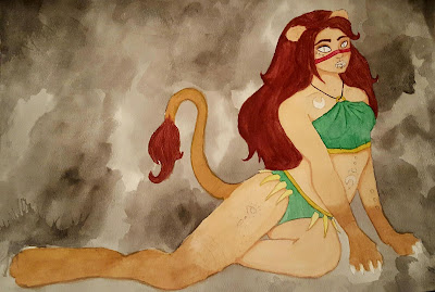 Hopefully I am going to finish this soon so it is complete and I can move on to Pisces and Gemini. I need to touch up the color I already have down with colored pencils and my Copic markers, and I need to paint the clothes with water color. After that, all I need to do is solidify the background and add Leo's tattoos. Then Leo will be complete.
Saying all of this, I am still not done with Leo for interim time, but here is the progress I have made so far:

Thursday, December 1, 2016
Nagle - Leo Process Page #2
This is the reference pose I used to draw Leo. The artist is Teh-Ryu-Neko and I found their DeviantArt page through Google. The link of the drawing is here: Reference. And this is an image of a lion I used to draw Leo's tail and paws (and a little bit of the mane to create her fluffy hair). Lion Image Link.
This is the final sketch of Leo that I will be using to create the final piece. While making a humanoid lion, I have to choose which parts are human and which are animal. At first, I was going to do a lion head on a human body and a tail, but the sketch of it looked very strange. So instead, I opted for human body with lion ears, teeth, eyes, paws, and tail. Next, I am going to print out smaller images of this sketch and swatch it to find the color scheme I wish to use.
Nagle - Signs Process Page #1
Before sketching anything for the signs, I researched some personality characteristics and the usual beliefs of what they look like. From this information, I will create my sketch and choose my color palette.
Leo
Leo's main personality characteristics are as follows, along with some design ideas:
Leo is a lion - neko
Charismatic - Strong pose
Confident - Strong pose, reddish hair
Narcissistic - Black background?
Royal - Green and yellow clothes
Pisces
Pisces's main personality characteristics are as follows, along with some design ideas:
Pisces is a fish - mermaid
Kind - Lighter colors
Sensitive - Pastel colors (pink and blue)
Creative/Dreamer - Looking/holding something like a shell
Indecisive - Maybe have a confused look or gesture
Gemini
Gemini's main personality characteristics are as follows, along with some design ideas:
Gemini are twins - twin avian girls
Curious - Looking at something
Versatile - Two wings, one on both sides of the characters
Selfish - Have them look self-conscious of their looks
Witty - Maybe glasses or a sour look, books
Subscribe to:
Comments (Atom)


