As you already know, I have been asked to join a game development team to continue/make better the game I created at USC over the summer. While it has been a slow start, we finally started on the production of the game and have a pretty solid idea of how this is going to go.
The first meeting we had was to introduce ourselves to those we did not know. The team consists of me, two students from the USC Program, Skylar and Finn, a teacher assistant from USC, Anthony, and two of Anthony's previous teammates, David and Cody. We also set up our main communication and how we are going to stay organized throughout the process of making the game. We're going to use Discord, a gamer communication program that has voice and text channels (like Skype except eons better), as our main source of communication. On Discord, we have text channels to discuss meeting-times, one that assigns our homework for the week, basic chat, a discussion chat, and multiple chats for each type of design (art, level, programming, etc.). This is where we also have our weekly voice meetings (every Sunday at 3). Another program is Trello, which is basically an organizational tool online, where we can assign roles and tasks to specific people and everyone can see everyone else's jobs (it's like a main overview, spreadsheet kind of thing). This is what we refer to to see our tasks that pertain to the game (unlike the homework which is more of a miscellaneous kind of thing). Lastly, we are using Google Drive to share all of the files we need during development. Such as the GDD, the latest Game Maker files, concept art, all the sprites and Photoshop files, and even documentation of what happens in all of our meetings (say, if someone is absent, etc.). We are actually looking into a more professional tool to accomplish all of this called Git, and we may switch over to it eventually (after a crash course because we heard it isn't too user friendly).
On to the good stuff: my role in my team. We discussed our roles in the team and Anthony is the leader/Producer who will be in charge of organization, communication, and the eventual dealing with getting the game on Steam, a hub to download games internationally; Cody is the sound guy who will find the sound effects and background music; David is one of the level designers who needs to match our narrative and gameplay to a fun yet hard and aesthetically pleasing platforming level; Skylar is another level designer, programmer, and will deal a bit with the art; Finn is... kind of a miscellaneous guy, but he is the original concept-creator of the game and already did a story board of our first cut scene; and for I, me, and my, I am basically the art lead who will be in charge of all of the sprite creation, hopefully more environmental elements, the screen title, and the one in charge of keeping the integrity of the game (keeping the team focused on the meaning that we want to achieve).
So far I have contributed to the GDD of the game, the meaning and a bit of story arch, but the main task I have just been given is the creation of another sprite for the princess and the concept art of a knight character. These two things are what I have been working on all week and I have four sprites to propose to my team for the princess and I am going to show what I have for the knight soon.
There is much more to the creation of this game, but for now this is a basic overview of the process the Project Princess Team is going through in order to create the final product we have deemed I Can Even.
Continuing with the making of game screens from last marking period where I made the You Must Choose screen, I decided to make another one for the game development team I recently joined.
We are recreating the game I was a part of at the USC Summer Program, and therefore kept the original title for it when I made the above screen. I really liked the silhouette idea from the first screen I made so I decided to reuse it. I also liked the aesthetic of the original castle so I kept that for the new one. What I had to change, however, was the character. I wanted a more steam punk princess due to the feminist theme of the game, so I made her dress more rugged and have feathers in her hair. Her weapon in the game is a sword so I included that in there. And since I wanted a little bit of a softer feel, I used a gradient to create the sky with more soothing colors. I have to say, while I love what it looks like, I don't like it for the theme of the game. We want a more hard-core feminist vibe so I think the princess looks to "soft" in this screen. So I may change the arm on the right to one holding a shield to make her more unapproachable; I feel like that arm gives her too much of a feeling of innocence or weakness.
My leader then decided to change the title of the game because Rising Sun isn't very relevant and I agree. So he wanted an image without the text so I took it off, and I believe it looks more like a desktop screen now. We're thinking of naming the game I Can Even, a spin off of the phrase "I can't even" that basically makes fun of girls. We were thinking of having an animation where the princess jumps up and slices off the "'t" of "can't" to leave it as I Can Even. This will give a funny ironic tone and we want to make the game comedic and strong at the same time so this title is a bit more fitting.
On the topic of my game development team, we've been having regular meetings weekly and this week I actually had homework. We were supposed to come up with a couple of sentences that describe our game's core value and this is mine: "No longer will women be defined by their beauty and be called weak. No longer will women be the ones to stand by and take the role of damsel in distress. Every woman has the right to be herself, fight for herself, save herself… and women will continue to break down castle walls and defy stereotypes." While it is a little harsh, I believe it shows our intention quite clearly. I am excited to be working on a game that supports my feminist views, and I can't wait to develop our strong, intelligent Princess.
Monday - No School
Tuesday - Trello/Concept Document
Wednesday - Altered TRS Screen
Thursday - Concept Document
Friday - Move all new stuff to original computer
For Christmas I received two new art tools that I am very excited to have gotten. I asked for a Uni Ball Signo White Gel-pen and the Pentel Brush-pen. I asked for these two specifically because almost all of the artists I watch on YouTube have these in their toolkit to make beautiful art. Plus, I really wanted a brush-pen to work on the line quality of my art. For English class, my teacher gave out extra credit and I thought the situation would be the best opportunity to test my new pens. Therefore, I sketched a scene from Milton's Paradise Lost where Satan and Michael are fighting "like planets colliding." So I sketched them fighting, lined the art with the Pentel brush-pen, water colored everything, and then used the gel-pen for details such as the stars, highlights, and giving a border around the two figures. I have to say I am proud of how this piece turned out in the end, but while I was outlining with the brush-pen I thought I was making a terrible mistake. The brush-pen was obviously not used to the best of its ability in my hands, but I hope to get better at using it. I think the first mistake I made was deciding to use it on such a small piece--brush-pens are good for larger, organic pieces. But now that I have attempted using it, I have learned how to use it better for next time and that's what matters.
Theme
In college I am majoring in Game Design and wish to focus on my favorite genre: fantasy games. One of the jobs I am considering is being a concept artist so I am starting those practices early by focusing on character design. My topics are the astrological signs and I am using previous generalizations of what the signs act like to create what I believe them to look like. As stated before, I am focusing on the fantasy of mythological creatures using humans infused with animals while also practicing concept art. Planning Sketches and What Inspired Me
The portfolio video I made with the idea of it being simplistic and clean, or professional. I did watch other people's reels on YouTube before creating mine but it didn't have any real impact on what I did for my video since I had set items to work with and limited knowledge of Premiere Pro. I cut the video into sections, much like an English essay, and had everything titled and transitioned with elegant font/traditional black background.
For Leo, I used a pose reference as I stated in a previous blog post (Here is the link: Leo reference). Here is the sketch I created of Leo before I started the final product:
I was very inspired by an artist Jackie deLeon (I did an artist page on her for this class) who incorporates tattoos in all of her pieces. I wanted to try this too after seeing her beautiful pieces, and that is why Leo has tattoos all over her. I think the tattoos fit in with the generalized hardcore attitude Leo supposedly has.
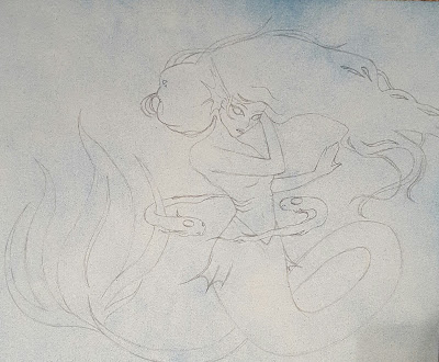
After given constructive criticism, I created the poses for Pisces and Gemini without a full-body reference. Instead I used what I know and what I remembered creatures such a mermaids look like. It definitely was more difficult than using references because I had to keep fixing the body proportions and really concentrate on making the figures look realistic (semi). Also for Gemini, I had to make sure the girls were mirrored and that was... difficult. Anyway, I drew Pisces with the idea that the composition would be formally balanced with her hair and tail giving weight on the opposite sides of her body and the idea of curved lines leading the onlooker around the whole image. I also wanted her to be unified by only using two colors and their shades/tones, and one background color. So, simplistic, unified, balanced (to emphasize the theme of yin and yang too), and the use of a gradient is the design and composition idea that I put into Pisces. As for Gemini, I also needed that idea of balance due to Gemini's twins always balancing each other out. Therefore, I made them like a mirror image to each other, formally balanced, and I am incorporating a reversed color palette to show how they are related but different (but also a mix of each other because I am reversing their wing color, to show you need a bit of both). I am incorporating experimentation with how I am mixing my paints to create the color scheme I want (I believe I just got down how to make all the colors the way I want them to look like).
Here is the blog post I created that has some inspiration I used to draw these three pieces: Inspiration Link.
Final Products
Above is my portfolio video, and I am actually really sad I don't get to add the art I am continuing to make as of now. I tried to make it have a professional feel and I used a camera to capture my pieces and Premiere Pro to make and edit the video.
This is "Leo" and, as stated in previous posts, I wanted the black to represent narcissism, the green and gold to represent royalty, red to show their temper, and tattoos to represent their "edginess." I made this like the other two pieces "Aries" and "Cancer." First I sketched her, then drew her onto the final paper, I used water colors, Copic markers, colored pencils, a chalk marker, a thin liner, and even covered the figure with a thin sheet of sticky paper to then spray paint the background.
For "Pisces" I decided to expand on my use of materials and try out acrylic paints. I also created this pose by myself, with inspiration from the past, not necessarily any strict reference. My previous pieces were also really big while my favorite kind of pieces are relatively smaller. So I decided to go back to smaller pieces and use acrylic. More details on Pisces' process is below.
This is the in-progress piece "Gemini." Since I liked the product of Pisces so much, I decided to make another piece the same way. I also did not use a reference for Gemini and I believe I am challenging myself with not only having one person, but two (who have to look the same by the way since they're twins). Again, more details of the process below. I really wanted to take my time on Pisces and Gemini to master this new painting technique and nail the vision of the pieces I have in my head.
Studio Habits/Materials
For the video, I used a camera to capture my art and then Premiere Pro to create the video.
For "Leo" I used water colors, Copic markers, colored pencils, a chalk marker, a thin liner, and spray paint. Her process was the same as the previous signs' where I sketched her, practiced color palettes on printed out copies, drew her on the final paper, and then painted and touched up.
For "Pisces" it was a little different and the first time me doing this. I got a small piece of paper, spray painted it with blue and white lightly (a dust), drew her on, and did this thing called under-painting where I painted the shadows and lights with shades of blue and later this helped me already have those shadows and highlights when I put on the real color. Then I watered down my actual color palette and painted her--I did do touch ups with color and added a quad-color element to shadows that's really noticeable in the tail. Since it then looked a little flat I went back in and painted the scales to add a nice highlight. You can see pictures of my progress with more details by looking at my previous bog posts for Pisces.
My fourth piece "Gemini" is still in progress since it took me a while to change my previous process, but so far I have spray painted the background (one side blue and the other white). I sketched on the twins, completed the under-painting (with different shadow and highlight colors so one of them will end up looking brighter than the other), and just finished figuring out how to mix all of the colors I want in my color scheme. I painted one side of the background navy blue, the left girl's wing navy blue, and today I just completed one girl's hair and the other's outfit with a minty teal color. Summary
In all, now that I have some pieces under my belt, I am extremely motivated to try a new material and get better by making my own original poses. Therefore, I switched to acrylic paints and I've drawn Pisces and Gemini without any references (that's why they are pretty stylized). I believe trying different medias and going out of my comfort zone is changing and expanding my artistic ability and hopefully you can see this change in my art in the future.
Monday - Self-reflection (Why am I here? Who am I? Why do I do this to myself?)
Tuesday - Game
Wednesday - Game
Thursday - Game
Friday - Half Day (aka no progress)
Intention Definition & Exploration of Ideas
After visiting George Mason again, it became apparent to me that I may not be using the correct materials to follow my goal of the year (make a game). Game Maker is considered a beginner game engine (this is true) and, even though I am a beginner, I realized it may benefit me to learn Unity while I have the time before it's necessary. Therefore, I am moving my project to Unity. Before coding however, I decided to make the menu select screen. At the beginning of this marking period, I also made my college portfolio video.
Planning
My MP1 Presentation said I was going to take breaks to make items for college, and that's exactly what I did at the beginning of MP2. I made a video portfolio. Once I finished with that (it took a long time), I needed to get back into my game. My goal before I took ten years on my college video were to get the basic controls down in Game Maker, finish the Rogue and enemy sprites, start on the environment objects, and do the beginning art such as the game menu screen. However, once I actually started on that I knew I wasn't going to get as far as I wanted.
Producing
First, I needed to start/finish my college portfolio. So, I gathered my art, took photos, put it all on Premiere Pro, and made a portfolio video. Of course I had to make sure I fulfilled the schools' requirements, and after doing so I produced this:
After I finished the video (it took me FOREVER), I went and made those basic controls in Game Maker (which also took me forever) only to now decide I'm going to make my game in Unity... so, I wasted that time. I decided that since I have so little time, I am going to keep the current Rogue sprite and if I really hate it at the end of production, I'll change it. I am going to base the guards off of the guards I made previously for The Rising Sun (as seen in the portfolio video). Then, I got really interested in the main menu screen. I did a lot of research on different styles and aesthetics, and I decided I really like the simplistic menus with a symbol of what's in the game. So I opted to make silhouettes of the first character, Rogue, and the first environment, the castle. I also only used 3 colors: black, white, and shades of orange. The image is below, however, I am going to go back in and add shadows to the text to make it stand out more. Other than that, this is a completed menu screen of my game.
Also, I just realized in the last MP checkup, I said I had not finished the GDD yet. The GDD is now, in fact, completed and you can find it here: GDD link.
Evaluating and Integrating
Again, I did not reach my goal but I also feel as if that is a good thing. I am glad I did not get far in production because I am now moving my game to Unity and I am not sure if my already-made art can be used in Unity (I have research to do). Also again, I feel behind. I have not completed a finished work except for the portfolio video (which I wish I had my current work I finished in it).
However, at first I felt upset... but then I was given an amazing opportunity. One of the teacher assistants from my time at USC (he's a USC Game Design Major) is creating a game development team to continue my previous game, The Rising Sun. He, of course, has asked me to be in the team and I get to recreate and better my work from the past. I believe this opportunity will give me direction the rest of the year and, while I am sad I may be putting my own original game on hold, I know working with a team with better my communication and my skills all around to create a product I am proud of. Our plan is to make at least 8 hours of gameplay for TRS and then submit to Steam for (hopefully) a green light so people from around the world can download it, play it, and maybe even give us money for it. Our planned finish time is around May/April.
So, even though it is not my originally stated game, I am still completing my goal for the year by producing a finished video game. This is better, in a way, because I actually have to go through the process of working with a team, communicating, organizing, and pulling my own weight to not let others down. I'm so excited it hurts.
Monday - No School
Tuesday - Freaking Out About Scholastics
Wednesday - Menu Screen
Thursday - Menu Screen Final Details
Friday - Finished Menu Screen and Put it on Blog