Tuesday, January 10, 2017

Nagle - MP2 Checkpoint

Theme
In college I am majoring in Game Design and wish to focus on my favorite genre: fantasy games. One of the jobs I am considering is being a concept artist so I am starting those practices early by focusing on character design. My topics are the astrological signs and I am using previous generalizations of what the signs act like to create what I believe them to look like. As stated before, I am focusing on the fantasy of mythological creatures using humans infused with animals while also practicing concept art.

Planning Sketches and What Inspired Me
The portfolio video I made with the idea of it being simplistic and clean, or professional. I did watch other people's reels on YouTube before creating mine but it didn't have any real impact on what I did for my video since I had set items to work with and limited knowledge of Premiere Pro. I cut the video into sections, much like an English essay, and had everything titled and transitioned with elegant font/traditional black background.
For Leo, I used a pose reference as I stated in a previous blog post (Here is the link: Leo reference). Here is the sketch I created of Leo before I started the final product:
I was very inspired by an artist Jackie deLeon (I did an artist page on her for this class) who incorporates tattoos in all of her pieces. I wanted to try this too after seeing her beautiful pieces, and that is why Leo has tattoos all over her. I think the tattoos fit in with the generalized hardcore attitude Leo supposedly has.
After given constructive criticism, I created the poses for Pisces and Gemini without a full-body reference. Instead I used what I know and what I remembered creatures such a mermaids look like. It definitely was more difficult than using references because I had to keep fixing the body proportions and really concentrate on making the figures look realistic (semi). Also for Gemini, I had to make sure the girls were mirrored and that was... difficult. Anyway, I drew Pisces with the idea that the composition would be formally balanced with her hair and tail giving weight on the opposite sides of her body and the idea of curved lines leading the onlooker around the whole image. I also wanted her to be unified by only using two colors and their shades/tones, and one background color. So, simplistic, unified, balanced (to emphasize the theme of yin and yang too), and the use of a gradient is the design and composition idea that I put into Pisces. As for Gemini, I also needed that idea of balance due to Gemini's twins always balancing each other out. Therefore, I made them like a mirror image to each other, formally balanced, and I am incorporating a reversed color palette to show how they are related but different (but also a mix of each other because I am reversing their wing color, to show you need a bit of both). I am incorporating experimentation with how I am mixing my paints to create the color scheme I want (I believe I just got down how to make all the colors the way I want them to look like).
Here is the blog post I created that has some inspiration I used to draw these three pieces: Inspiration Link.

Final Products
Above is my portfolio video, and I am actually really sad I don't get to add the art I am continuing to make as of now. I tried to make it have a professional feel and I used a camera to capture my pieces and Premiere Pro to make and edit the video.
This is "Leo" and, as stated in previous posts, I wanted the black to represent narcissism, the green and gold to represent royalty, red to show their temper, and tattoos to represent their "edginess." I made this like the other two pieces "Aries" and "Cancer." First I sketched her, then drew her onto the final paper, I used water colors, Copic markers, colored pencils, a chalk marker, a thin liner, and even covered the figure with a thin sheet of sticky paper to then spray paint the background.
For "Pisces" I decided to expand on my use of materials and try out acrylic paints. I also created this pose by myself, with inspiration from the past, not necessarily any strict reference. My previous pieces were also really big while my favorite kind of pieces are relatively smaller. So I decided to go back to smaller pieces and use acrylic. More details on Pisces' process is below.
This is the in-progress piece "Gemini." Since I liked the product of Pisces so much, I decided to make another piece the same way. I also did not use a reference for Gemini and I believe I am challenging myself with not only having one person, but two (who have to look the same by the way since they're twins). Again, more details of the process below. I really wanted to take my time on Pisces and Gemini to master this new painting technique and nail the vision of the pieces I have in my head.

Studio Habits/Materials
For the video, I used a camera to capture my art and then Premiere Pro to create the video.
For "Leo" I used water colors, Copic markers, colored pencils, a chalk marker, a thin liner, and spray paint. Her process was the same as the previous signs' where I sketched her, practiced color palettes on printed out copies, drew her on the final paper, and then painted and touched up.
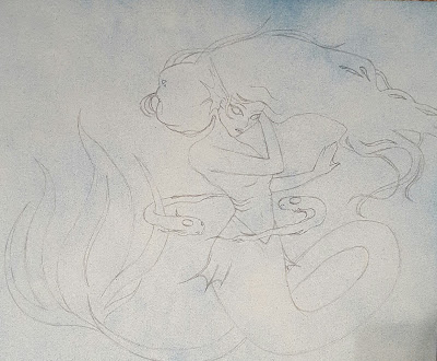
For "Pisces" it was a little different and the first time me doing this. I got a small piece of paper, spray painted it with blue and white lightly (a dust), drew her on, and did this thing called under-painting where I painted the shadows and lights with shades of blue and later this helped me already have those shadows and highlights when I put on the real color. Then I watered down my actual color palette and painted her--I did do touch ups with color and added a quad-color element to shadows that's really noticeable in the tail. Since it then looked a little flat I went back in and painted the scales to add a nice highlight. You can see pictures of my progress with more details by looking at my previous bog posts for Pisces.
My fourth piece "Gemini" is still in progress since it took me a while to change my previous process, but so far I have spray painted the background (one side blue and the other white). I sketched on the twins, completed the under-painting (with different shadow and highlight colors so one of them will end up looking brighter than the other), and just finished figuring out how to mix all of the colors I want in my color scheme. I painted one side of the background navy blue, the left girl's wing navy blue, and today I just completed one girl's hair and the other's outfit with a minty teal color.

Summary
In all, now that I have some pieces under my belt, I am extremely motivated to try a new material and get better by making my own original poses. Therefore, I switched to acrylic paints and I've drawn Pisces and Gemini without any references (that's why they are pretty stylized). I believe trying different medias and going out of my comfort zone is changing and expanding my artistic ability and hopefully you can see this change in my art in the future.

No comments:

Post a Comment