Wednesday, December 21, 2016

Nagle - Studio Work #3

Here is the final product of Pisces. I created more shadow with more shades of pink and then created very light blue and pink to create a scale pattern. Since Pisces is two fish circling each other, I decided to go with the traditional yin and yang to symbolize how Pisces needs both sides of themselves. I very much enjoyed the process of making this piece and I may continue with it for future pieces. I think it turned out amazing compared to the others (even though now that I look at the picture, I wish I did more dimension in the middle part of her hair, but hey, Finish, Not Perfect).

Nagle - Pisces Process #2

Done with the under-painting, I wanted to create a more dramatic contrast of the figure from the background. So I settled for a more greenish-blue to paint the background. I did mess up and had a very dark spot in the upper left corner, so I fixed it by kind of creating a transition from a darker green to a lighter one.
Then, I chose the colors of the mermaid and settled with more pastel colors. The under-painting helped so that one coat of the same shade of pink and blue made pre-made shadows and highlights. I did go back in with a slightly darker shade of that color to emphasize the shadows.

Nagle - Pisces Process #1

For Pisces, I decided to try something different and make a smaller piece using acrylic paint. First, I spray-painted the background with blue and white to get an interesting texture in which I drew my sketch on (above). Second, Mr. Nagle suggested I try under-painting--so I took a very watered-down blue and chose where the darkest parts of the piece were going to be (shadows). Then, I took a light watered-down blue to do the same thing for highlights. Below is what the piece looked like once I was done.

Monday, December 19, 2016

Bomboy - The Met and MoMA Reflection

Last Friday, art students went on a field trip to New York City where we visited The Metropolitan Museum and the Museum of Modern Art. While there, I saw many interesting pieces of art history and some stuck in my mind.
First, we went to The Met. Here, since I already been before, I wanted to focus on some of the exhibits that I previously wished I had more time at. That included Africa, the armor and weapons, and Egypt. Africa always interested me because most of it was huge wooden pieces that showcased their culture. For example, there were wooden and grass suits that they wore to worship the recently deceased and towering totem poles that emphasized their interest in the human body. Next, I had always been interesting in the intricate details some armor and weapons have, and I was not disappointed with the collection here. I have to say I think my favorite item there was either one of the halberds that were full of designs or this hunting knife/gun hybrid that just looked amazing (I want to know if it worked well). After that, it felt like I stepped into Egypt with the temple that was rebuilt in the museum and I got to see beautiful jewelry and games they used to wear/play in the past. One of the interesting things I saw there were gold-encasings for fingers and toes. I guess it was some sort of a jewelry? I don't see how you could do anything wearing them though... maybe they were for the dead? (Idk, there was a huge gaggle of kids in front of the sign and I was not about to fight through that.) Other than that, there were a ton of rings with scarabs on them and I wish I owned one because that is my kind of aesthetic attraction--small and simple, but also beautiful. After The Met, we trekked through Central Park, past Trump Tower, through the biting cold, and made it to the MoMA.
I also had visited the MoMA in the past, but I saw pieces that I do not remember (most of them being phallic and scarring in nature). Now, I am absolutely NOT a huge fan of modern art, but I sure did get some good laughs out of some of it. For example, one of the pieces was literally a string. Yes, a string. One that was attached to the ground and the ceiling and not noticeable at all so a guard had to stand next to it to ensure someone didn't run into this poor string and snap it. Or maybe I should bring up the white chair made out of the male appendage. Or maybe the TV that showed a video of a very naked man holding a balloon jumping on a couch where a very naked woman sat and watch their masculine/feminine parts fly everywhere. (A FIVE YEAR OLD SAT DOWN AND WATCHED THAT--WHY!?!) But anyway, I also saw some pieces I do like--Starry Night, Three Musicians, etc (aka not scarring items).
In all, while not everything was my favorite (hey, that's art for ya), I did see art pieces that I did thoroughly enjoy seeing and gain inspiration from. Now, I definitely think I had my fill of those museums and I wish to never return (I'm sorry, I don't like the cold, cities, or museums (Why did I go you ask? To break the system.) but I did end up enjoying myself so meh).

Bomboy- Schedule 12/12-12/16

Monday - Main Menu Screen
Tuesday - ^
Wednesday - ^
Thursday - ^
Friday - NYC Field Trip

Monday, December 12, 2016

Nagle - Leo: Studio Work #2

Here is the finished product of Leo. I used water color for the base colors, then went back in with Copic markers, colored pencils, a chalk marker, and black spray paint (for the background). At first I really disliked this piece, but now that it is finished I like it a lot more. I like the idea of the tattoos, I may continue those in my future pieces (I just may use a different media to draw them in). Not all of it is as I envisioned it to turn out, but I'm still happy with the turn out. That's three astrological signs down, nine to go.

Sunday, December 11, 2016

Bomboy - Main Menu Screen Design Idea

Finally back to working on my game, I think I am in denial that I have to go back to Unity. So instead, I decided to make my main menu screen. I am either going to make it in Illustrator or Photoshop, but I want to try and make it actually look good. I already made the HUD screen in Illustrator (can be found in the GDD) but the main menu is going to be a lot more work.
The main menu is supposed to be more artsy and hold the attention of or even intrigue the player. I found some examples of main menus, each with a different take. Two have the recognizable game title on them while one does not. They all have basic options such as Start Game. One is more simplistic while the other is more abstract and the next has more details. I just have to decide the formula for my screen.
I like the idea of either the simplistic screen or the one with more details and perspective. I also want the game title to be visible, but maybe not as big as the Halo example one. I was thinking that I could try and design what the rest of the characters in the game will look like and then have their silhouettes be the main menu. The black silhouettes of all the characters with a eye-catching color behind them. The title could be in their legs--the more solid black part probably--and have the selections below that.
That, or try and decide if the Voice is going to be somebody. As in, maybe design the Voice, and then have their silhouette with glowing eyes or something creepy.
I don't know, I still have a lot of ideas bouncing around in my head but these examples will help me decide what I think will look nice and what will look nasty.

Bomboy - 12/5-12/9

Monday - Unity Tutorial
Tuesday - Unity ;-;
Wednesday - Illustrator: Main Menu Game Screen
Thursday - Animation Class Critique
Friday - Animation Class Critique

Monday, December 5, 2016

Bomboy - Schedule 11/28-12-2

Monday - No School
Tuesday - Sick
Wednesday - You weren't there ;-;
Thursday - New computer = Blogger
Friday - Sketching Character Ideas

Sunday, December 4, 2016

Artist Research: Jacquelin de Leon

Jacquelin Deleon
Jacquelin de Leon is a freelance artist from San Jose, CA, who currently lives in Austin, TX. She graduated from Laguna College of Art and Design with a BFA in illustration and entertainment design and is now a YouTube artist. Every week, she records herself creating a piece of art, edits it, puts a voice over and music in it, and then uploads it to YouTube where her 124,772 subscribers get to pour over it.
Image result for jacquelin de leonImage result for jacquelin de leon
Jackie mainly uploads her sketches that usually consist of a girl with tattoos. She is extremely interested in tattoos (she says it's her favorite part because she gets to imagine what tattoos the person in her drawing would actually get), mermaids, and hands (another favorite part--she's not a normal artist then ;-;). When she was younger, she mostly drew males and animals.
Image result for jacquelin de leonImage result for jacquelin de leon sketches
Her process is usually a sketch in her sketchbook with a red Prisma Color pencil, that she then paints with watercolors, lines with her Pentel pocket brush, and then touches up with more colored pencils--the tattoos are drawn last. However, she also has videos where she uses ink, acrylic, a light board, digitally speed paints, and even has how-to videos.
Image result for jacquelin de leon sketches
 Jacquelin's process and art inspired me to want to attempt her style. I'm interested in water colors and Pentel brushes, and since I haven't found my own process yet, I am going to see if I like hers. I found her a while ago, and have since then I have already created some water color pieces for my zodiac sign series, but from now on I may create the rest of the pieces the Jackie-way.
Image result for jacquelin de leon the sirens
Another very interesting thing about Jackie is that she self-published a graphic novel named The Sirens of San Fransisco. In the comic, there are three hard-core girls who are in a gang (thus "the Sirens"). Her comic is for sale on her official website as well as her prints. She self-makes prints of her artwork (she has a how-to video on this) and sells them on her online store.
In all, I have been very inspired by de Leon lately and I can't wait until she uploads her next video. (You can find her YT page here: JackieYT and her store here: JackieStore.)

Nagle - Leo Process Page #3

Leo is one of the two pieces that are due during the interim time of the second marking period. I already had some draw backs and wasted time because, after attempting the background and not liking it, I became very discouraged. Instead of working on it, I procrastinated and spent my time working on my portfolio video. Now that I finished the video, I am back working on the piece and I believe the small break helped me. To fix what I believe is ugly, I am just going to paint the entire background black. Since the piece is character creation, this will force the viewer to look only at Leo. Also, a characteristic of Leo is being narcissistic and I can probably show this with the black background.
Saying all of this, I am still not done with Leo for interim time, but here is the progress I have made so far:
Hopefully I am going to finish this soon so it is complete and I can move on to Pisces and Gemini. I need to touch up the color I already have down with colored pencils and my Copic markers, and I need to paint the clothes with water color. After that, all I need to do is solidify the background and add Leo's tattoos. Then Leo will be complete.

Thursday, December 1, 2016

Nagle - Leo Process Page #2

This is the reference pose I used to draw Leo. The artist is Teh-Ryu-Neko and I found their DeviantArt page through Google. The link of the drawing is here: Reference. And this is an image of a lion I used to draw Leo's tail and paws (and a little bit of the mane to create her fluffy hair). Lion Image Link.
This is the final sketch of Leo that I will be using to create the final piece. While making a humanoid lion, I have to choose which parts are human and which are animal. At first, I was going to do a lion head on a human body and a tail, but the sketch of it looked very strange. So instead, I opted for human body with lion ears, teeth, eyes, paws, and tail. Next, I am going to print out smaller images of this sketch and swatch it to find the color scheme I wish to use.

Nagle - Signs Process Page #1

Before sketching anything for the signs, I researched some personality characteristics and the usual beliefs of what they look like. From this information, I will create my sketch and choose my color palette.
Leo
Leo's main personality characteristics are as follows, along with some design ideas:
Leo is a lion - neko
Charismatic - Strong pose
Confident - Strong pose, reddish hair
Narcissistic - Black background?
Royal - Green and yellow clothes
Pisces
Pisces's main personality characteristics are as follows, along with some design ideas:
Pisces is a fish - mermaid
Kind - Lighter colors
Sensitive - Pastel colors (pink and blue)
Creative/Dreamer - Looking/holding something like a shell
Indecisive - Maybe have a confused look or gesture
Gemini
Gemini's main personality characteristics are as follows, along with some design ideas:
Gemini are twins - twin avian girls
Curious - Looking at something
Versatile - Two wings, one on both sides of the characters
Selfish - Have them look self-conscious of their looks
Witty - Maybe glasses or a sour look, books

Wednesday, November 30, 2016

Nagle - 2nd Marking Period Proposal

This marking period, I am continuing the Astrological Sign series. This time, I will make Leo, Pisces, and Gemini. I sketched and planned some ideas for the final products above. My fourth piece for the marking period is my portfolio video that I am using to submit to colleges.

Sunday, November 20, 2016

Bomboy - Schedule 11/14-11/18

Monday - Premiere Pro
Tuesday - Premiere Pro
Wednesday - Taping game footage
Thursday - Premiere Pro
Friday - Finishing touches on video

Bomboy&Nagle - Portfolio Video (AKA Studio Work #1)

After a couple of weeks (actually now that I think about it, it was probably more like a month), I've been working on pulling all of my art throughout my high school career together to make a portfolio video to submit to colleges. Though I do regret I did not add everything I wished to, I am still pretty confident about the product. I am sending this to George Mason University and the University of Southern California as of right now.
Reflection: At first, I thought this was going to be easy. I've made videos before, right? Well, I was wrong. Finding the time to photograph, saving/finding all the videos I desired, and then just turning it into a finished product I'd be proud of was difficult. However, due to deadlines, this is what was created with my time and ability and I am content with what I have made. I may be a little uneasy just because someone is going to watch this and judge my abilities only based on this video; if it wasn't made for that purpose, I'd bet I'd be happier with it. In all, I hope this video is successful and I guess I'll find out when I receive my acceptance/denial letters.

Monday, November 14, 2016

Bomboy - Line Weight Test

Last week I did an investigation on line weight and why and how it is used. This week I took a drawing I did in one line weight and changed it based on my discoveries. In the "new" version I added a light source to the upper left corner and then darkened the figure from there. I have to say the face of the new one does have more interest than it used to and the darker lines draw my eyes to the sketch. This line weight thing does hold validity in making my plain sketches a little more eye-catching. However, as you can tell, I am not good at it right now, but hopefully that will change in the future.

Sunday, November 13, 2016

Bomboy- Schedule 11/7-11/11

Monday - Edited Pictures
Tuesday - Edited Pictures
Wednesday - Gather digital model pictures
Thursday - Gather animations
Friday - Gather videos

Sunday, November 6, 2016

Bomboy - Line Weight and Jacquelin Deleon

Image result for line weightImage result for line weight
Line weight refers to the thickness or thinness of a line. It can be used to give a feeling or tension and weight or emphasis. The weight of a line may also be used to create a sense of motion or depth. Or, line weight can be used to show where a light source may be and the shadows as a result.
Image result for line weight
Above, I found this image where first the brush stroke goes from thin to heavy. In perspective, the thick end would be closer. Usually for perspective, the closer the object is to you, the bigger, and the further away, the smaller. The circles, on the other hand, shows why using thin or thick lines can emphasize depth. If everything was drawn with the same line weight, it would look flat. Background objects should have thinner lines and foreground objects should have thicker lines.
Image result for jacquelin deleonImage result for jacquelin deleon line art
Currently I am obsessed with watching a YouTuber's art videos and she pretty much has perfected the use of line weight. Above are two of her pieces where I thought you could see the line art the best and the weight of the lines to make her pieces more aesthetically pleasing. Her name is Jacquelin Deleon and her name there is linked to her YouTube channel. She's a freelance artist who mainly gets commissions to design tattoos and also self-published a comic booked named "The Sirens of San Francisco". She lives in San Jose, CA, and graduated from Laguna College of Art and Design with a BFA in Illustration and Entertainment Design. Watching her process (many times at this point) is very interesting and I believe will help me find my own process; also, she uses a brush pen to line her art and I think I am going to go get one to help with my line weight.
As pointed out to me, my art only has one line weight and has resulted in my pieces looking flat. I need practice implementing line weight. Next week, I am going to do a sketch test with line weight (much like the examples above) as my sketchbook page and also try and use it in my pieces for Senior Portfolio.

Bomboy - Schedule 10/31-11/4

Monday - GDD
Tuesday - Portfolio Pictures
Wednesday - Portfolio Pictures
Thursday - Portfolio Pictures
Friday - Portfolio Pictures

Monday, October 31, 2016

Bomboy - Game Concept Art

Here is a quick concept art piece of what I envision Rogue, a character in You Must Choose, to be doing and seeing when he is first introduced on the cliff overlooking the town and castle in the distance. I quickly sketched this with a loose grip (top of the pen) with a black lining pen. I added shading with hatching and cross hatching. Then I went over it, again very loosely, with strong, pigmented water color. I wanted it to feel loose, lively, and, therefore, magical or fantasy-like (this is also why I used such an interesting color palette that's pretty dry). So, that's some concept art and this is also marking progress with my ideas. I am also almost done with the GDD (celebrate!!).

Bomboy - Schedule 10/24-10/28

Monday - Finished HUD
Tuesday - Started Controls (Illustrator)
Wednesday - Finished Controls
Thursday - GDD
Friday - Pep Rally Practice

Tuesday, October 25, 2016

Nagle - MP1 Checkpoint

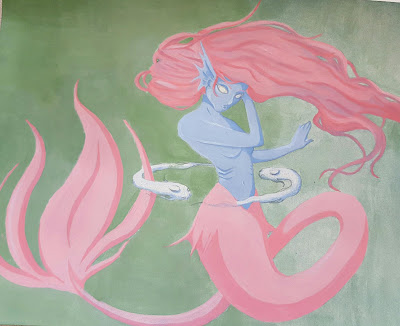
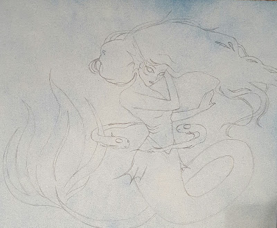
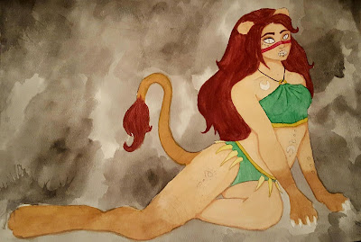
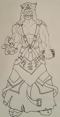
Planning Sketches and References
My idea to create the Astrological signs as humanoids involved preliminary research. I looked up the attributes linked to Aries and Cancer and used those to make my sketches and choose my color palettes. For example, Aries is usually passionate, sexy, stubborn, and aggressive. Therefore, I drew Aries in suggestive clothing and chose red as the eye-catching color. As for Cancer, they are caring, protective, clingy, and loyal. This suggests softer cold colors, so my color palette will consist of blues and purples.


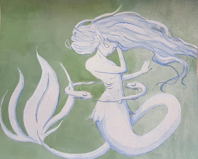
I did use some references for my drawings and the pictures are above, but otherwise you will find separate blog posts with more details here: Aries reference and Cancer Reference.
After the sketch, I scanned and printed out smaller versions and swatched them. This way I could eliminate color palettes that I initially thought would look good, but look disgusting, and let me find palettes that I wouldn't expect to look nice.

Studio Habits and Product
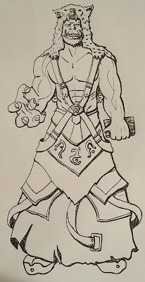
After all of my preliminary work, I started on the final pieces. First I copied my sketches onto water color paper using a projector and then started with water colors. Once done with the water colors, I went back in with Copic markers, colored pencils, and a chalk marker to fix the colors and add details. The backgrounds are just water color, chalk marker, and a black lining pen.

Curatorial
Ever since I was young, I loved games. Games let people come together, whether it be digital, physical, or imaginative, and, now that I am older, I want to contribute to this social, loving environment. For college, I am going to major in Game Design and wish to be employed at a game company that mainly creates fantasy games; therefore, I am interested in fantasy and wish to study some aspects of it through concept design (the job I am currently considering). I am aware of the zodiac signs and the geek culture of fantasy games and role playing games, and this is where my creations are inspired from. I thought the best way to infuse everything together was to use the Astrological signs and make character designs out of them; this lets me practice in a unique way rather than creating the typical armored, fighting type of character. I am focusing on the fantasy of mythological creatures using humans infused with animals while also practicing concept art.

In my pieces, I used water color, colored pencils, Copic markers, and a chalk marker to create smooth, gradual surfaces with more delicate detailing and colors. The colors transition and are used to flatter and I added multiple layers of color to create shading. I put a lot of lines in the hair and fur and have details in the clothes. Character design is usually rough and light, so water color is usually appropriate for this (also, the lightness can be mystical and emphasize the mystical creatures); then, many artists go back in and line or refine the piece. I am trying very hard to make Aries and Cancer look nice while using media I do not understand (I blame this for being behind... plus I'm a terrible perfectionist). These pieces are appropriate to my idea because a huge part of Game Design is the design of the characters. Making the Astrological signs is practice and an example of character design.

My pieces represent how I imagine Aries and Cancer to look like as a humanoid goat/crab. Each zodiac has its own personality and behavior, so based on those, this is how I perceive them to be. Since my art is intentionally concept art of characters, I made sure the figures were showcased. For instance, Aries seems to be sitting, but the absence of the object makes the viewer focus wholly on the character design, and maybe later she will be placed in an environment. The dominant elements found in the pieces include a very smooth/soft texture, value, and direction. The dominant principles are gradation, contrast, and dominance.

Something I learned is that I thought water color was going to be perfect for my piece, but I ended up covering it with colored pencils anyway. Instead of it being the main media like I thought it would be, it ended up being the construction colors for different media. Which I find interesting. I enjoy the series I set myself up to do for the year, I just hope I get better using the media I want to use.

Monday, October 24, 2016

Bomboy - George Mason

First of all, you can check out the progress on my GDD here: Clicky.
Second, George Mason...
Image
... is a university in Fairfax, VA, that offers a Game Design major.
Officially, at Mason, it is called the Computer Game Design Program. In this program, students study both the sciences and the arts, in a revolving-role team-based, project-based teaching environment. It hosts a B.F.A. undergraduate degree, a graduate M.A. degree, and several minors and partnerships. Mason also hosts the U.S. Serious Game Institute, which concentrates on game-related applied research and new innovative game company cultivation.
George Mason University
The B.F.A. in Computer Game Design requires 120 credits and includes general education courses. The curriculum comes from computer science, visual arts, digital arts, computer music, and a new game design area of study. There is also a required internship. This degree prepares students for computer game design and development field employment. 
George Mason also has a pep band with cymbals, a Tae Kwon Do Club, and a small, personal and beautiful campus. I visited GMU and the computer labs were full of different kinds of computers--a dream for a nerd-- and a whole art building and nice facility full of inspiration. It is also in the top 100 colleges for game design. I applied to George Mason already and it is currently my third choice.
The George Mason Game Design Program Link: GMUGame.
Also, I'd like to include GMU's stated mission through having the Computer Game Design Program and a video where GMU students talk about their experience.
Mission: The Mission of the Computer Game Design Program at George Mason University is to prepare students for employment and further study in the computer game design and development field, doing so with a curriculum designed to reflect the gaming industry’s demand for an academically rigorous technical program coupled with an understanding of the artistic and creative elements of the evolving field of study.

Sunday, October 23, 2016

Bomboy - Schedule 10/17-10/21

Monday - GDD
Tuesday - GDD
Wednesday - Started HUD in Illustrator
Thursday - Illustrator
Friday - Illustrator

Friday, October 14, 2016

Nagle - Cancer Reference Pictures

For my Cancer image, I just mashed a human and crab together. To make sure the crab was accurate, I looked up crabs images and also found potential color palettes. I am now between this blue crab or the purple crab. But these are the photos I used for the correct anatomy of a crab and eventually the colors.


Bomboy - Marking Period 1 Presentation

Intention Definition & Exploration of Ideas
As stated in my themes for the year that influence my art, my area of digital media I am going to focus on is everything that involves the creation of video games. This includes Game Maker (to make the game), Photoshop (art for the game), and Word (planning/writing, GDD).
Planning
My plan for the whole year is to focus on making and near-perfecting a huge project (video game) and, when bored or stressed of it, possibly make smaller games or make digital art like last year. Based on that, my goal for the first marking period was to re-familiarize myself with Game Maker and Photoshop, create the game concept, start a little bit of the art, and type the GDD. Along with my major goal, I expect to put it on hold whenever I had to do something for a college such as a video or create my portfolio.
Producing
Well, I did do a ton of research on Game Maker again and looked up how to create a successful video game. With this information, I decided on the scope of my game, created the basic look of the first main character, and started the GDD. I did a couple sketchbook pages with my progress, ideas, and inspirations but here I am just going to post the important stuff.
First, my GDD can be found here: GDD Link.
Second, here is the Rogue character sprite:
It's a bit blurry because it's a really small image... sorry. Anyway, I created this character with the intent of keeping it a very traditional rogue (hood, dark colors, and daggers) and to give it a feature that stands out, I gave him bright green eyes. I was happy with the outcome, but now that I think about what I want to create, I wish I made a female. So the Rogue sprite may change, but if I were to do that, I think I will do it at the end when everything else in the game is completed.
Evaluating and Integrating
I did need the time at the beginning to understand the complicated Game Maker again and work my brain around having to create a whole game by myself, and because of that I do feel behind. I did not finish the GDD like I wanted to (but that may be because it's boring and hard). However, even though I did not reach my intended goal, I do feel that this first marking period was valuable. I wanted to make sure I set up my game correctly instead of jumping right in with the possibility of messing up. In the long run, I believe this was safer and is saving me from completely messing up and having to start over. Now that I have played with Game Maker again, I feel more confident for when I truly start coding, and having the GDD will prevent me from making huge mistakes, keeping me on my original goal, and not go beyond my scope (not adding the "what if"'s that will just extend and possibly ruin the creation of my game--they're dangerous).
ANYWAY, I am sorry because you told me not to write as much and I actually tried to do that but... sorry, I failed. Hope you had fun reading :D

Schedule - 10/10-10/14

Monday - No School
Tuesday - George Mason Video Essay
Wednesday - GM Video Brainstorm
Thursday - GM Video Watching (and crying)
Friday - You Must Choose

Sunday, October 9, 2016

Bomboy - Artist Inspiration: Shovel Knight

Image result for shovel knight pixel art
     Shovel Knight is a 2D side-scrolling platform game created by Yacht Club Games. The player controls the protagonist as he collects treasure and fights the Order of No Quarter. The art decided on for the game is the traditional 8-bit style and chiptune soundtrack both in the style of older video game titles from the NES era. In fact, Shovel Knight mimics most of the style from older video games and even limited itself to the NES color palette and animation count. This means that the larger sprites were superimposed on a black background to keep the limit of colors available realistic. More NES limitations include camera shakes that only act on a single axis and a game interface that acts as a background layer instead of being overlaid on top of the gameplay. Actions available mainly involve Shovel Knight's shovel, which he can either use to attack enemies head on and dig up treasure, or aim below him while jumping to bounce on enemies. The goal throughout the game, other than the obvious fight through each level and defeat the boss at the end to progress, is to collect as much treasure as possible. This treasure can then be used to buy items in the game. In all, Shovel Knight is a successful 2D platformer that has achieved critical acclaim and has won various awards.
     These are the 8-bit sprites of the main character, Shovel Knight. The art style inspires me because I am making a 16-bit game and seeing the style in use helps me visualize and understand how my designs are going to look or fit into my game. I also did not realize how detailed 8-bit characters could become; I always thought 8-bit meant less details and a more simplistic design. I decided on 16-bit because I want to ensure the details in my game; my hope is to get my game as beautiful as some 2D games such as Shovel Knight.
     Again, my goal is to achieve this atmospheric and detailed world such as that the Shovel Knight lives in. Also, my HUD is going to be as simple as the one pictured above. Life counter, how many more levels until the decision, and a timer to calculate the points for how fast the players are going.

     Overall, this traditional 2D side-scrolling platformer has inspired my art, concept design, and gameplay functions for my own game. This game is rated 10/10 on Steam and also in my personal ranking of good games. While I've already started, I am excited to create my own characters, villains, and environments dot-by-painstaking-dot.